SwiftUI Accessibility (Part 1)
Accessibility is an often overlooked feature that improves the user experience and enables more users to use your app.
Apple highlights how key accessibility is and has created a rich set of APIs and tools to support it. I recommend reading through the guidelines provided by Apple to get a feeling of the big picture.
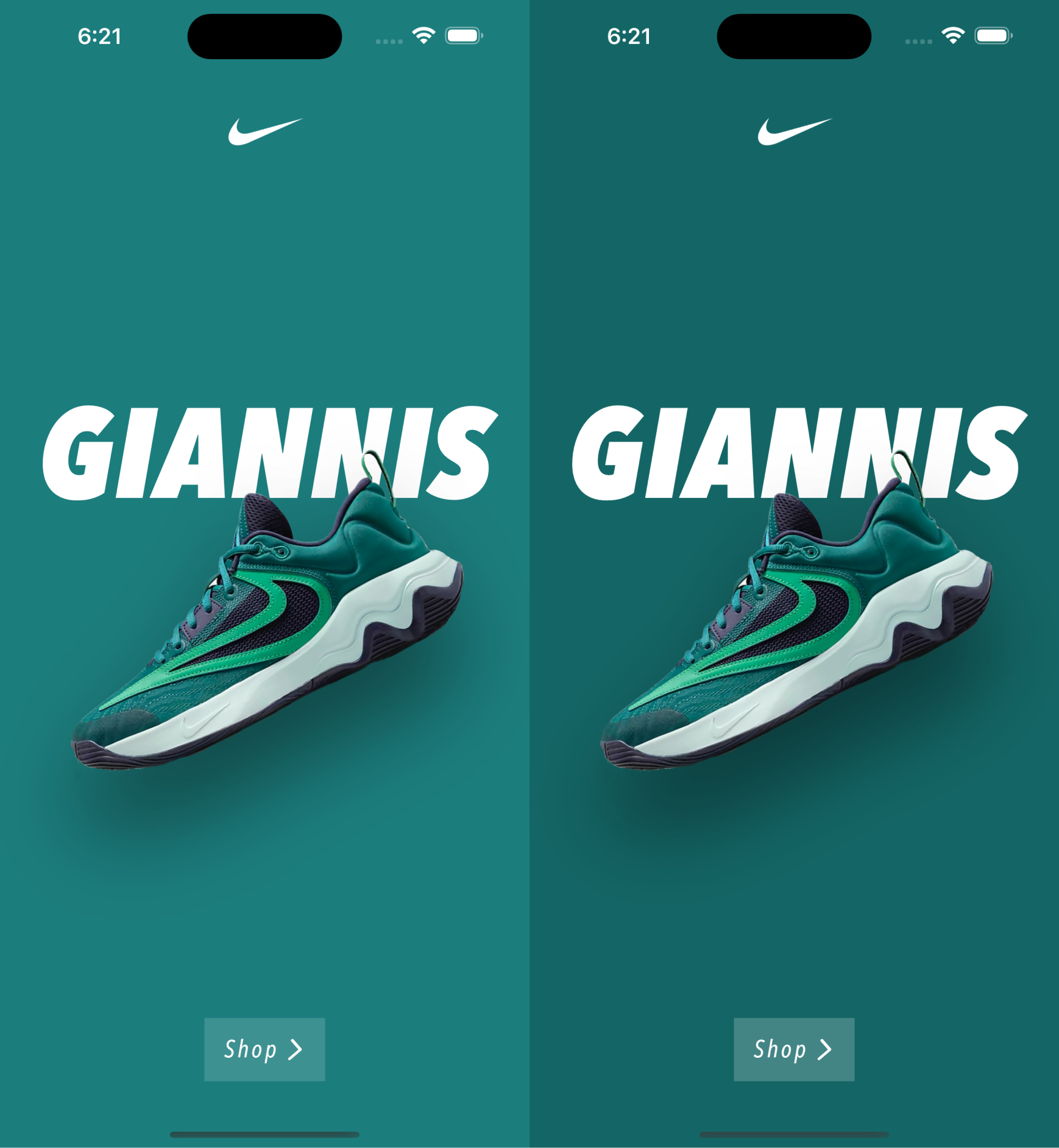
In this article we are going to take the sneakers concept we built for the SwiftUI letter scroll animation and improve the accessibility of the app. It's a very simple app, but even in such a simple example there is a lot we can improve.
Localisation
It might seem an obvious point, but it's a very important one. Translating the texts in your app to more languages, makes your app more accessible to more users.
In our example we select File > New > File.. and create a new String Catalog. Then we add the language, Spanish in our case, and translate the Strings.

If you would like to go in depth I recommend the documentation provided by Apple.
Dynamic type
Allowing the user to scale up or down the font sizes is also a very important feature. Enabling this option, does not make your app only more accessible, it also leads to a better and more flexible UI overall.
In our example the change is straight forward. Instead of using a fixed font size:
font(.custom("AvenirNextCondensed-Italic", fixedSize: 20))
We use a dynamic size:
font(.custom("AvenirNextCondensed-Italic", size: 20, relativeTo: .body))
That's it. With this change in place the text size adjusts automatically to changes of the dynamicTypeSize environment value.
You can set this value in the Preview to see how your view looks like:
#Preview {
    MyView()
        .environment(\.dynamicTypeSize, .accessibility2)
}
When previewing it you see that the text size increases accordingly, but you also might notice that spacings and paddings stay fixed.
An easy way to improve this is to define a @ScaledMetric value to adjust the padding accordingly:
@ScaledMetric(relativeTo: .body) var paddingScaleFactor = 1

func makeBody(configuration: Configuration) -> some View {
     configuration.label
	     .padding(.vertical, 12 * paddingScaleFactor)
	     .padding(.horizontal, 16 * paddingScaleFactor)
}
To make this cleaner and more reusable we could also create a custom View Modifier:
struct ScaledPaddingModifier: ViewModifier {
    let edges: Edge.Set
    let length: CGFloat?
    @ScaledMetric private var scaleFactor = 1

    private var paddingValue: CGFloat? {
        guard let length else {
            return nil
        }
        return length * scaleFactor
    }

    init(edges: Edge.Set, length: CGFloat?, relativeTo: Font.TextStyle) {
        self.edges = edges
        self.length = length
        self._scaleFactor = ScaledMetric(wrappedValue: 1, relativeTo: relativeTo)
    }

    func body(content: Content) -> some View {
        content
            .padding(edges, paddingValue)
    }
}
Then we define an extension on View
extension View {
    func padding(_ edges: Edge.Set = .all,_ length: CGFloat? = nil, relativeTo: Font.TextStyle) -> some View {
        modifier(ScaledPaddingModifier(edges: edges, length: length, relativeTo: relativeTo))
    }
}
And use it in our View
func makeBody(configuration: Configuration) -> some View {
     configuration.label
	     .padding(.vertical, 12, relativeTo: .body)
	     .padding(.horizontal, 16, relativeTo: .body)
}
Bold texts
The Bold text accessibility setting increases the fontWeight of the texts in your app. In our example project adopting this feature is also straight forward.
We read the legibilityWeight value from the environment
@Environment(\.legibilityWeight) var legibilityWeight
and then set the correct fontWeight depending on the value
configuration.label
	.font(.custom("AvenirNextCondensed-Italic", size: 20, relativeTo: .body))
	.fontWeight(legibilityWeight == .bold ? .bold : .medium)
Like with the dynamicTypeSize, you can preview the result by setting the legibilityWeight environment value
#Preview {
	MyView()
	.environment(\.legibilityWeight, .bold)
}
Increase Contrast
This setting increases the contrast between the app’s foreground and background colors. In our example we are going to do a very subtle change. Depending on if the setting is enabled or not we are going to set a slighly different background color and highlight a bit the cta button.

It's subtle but it's already very effective.
Let's take a look first at the background colors. There are different ways we could approach this. In our example we are going to create a Color Set for each color in our Asset Catalog. And then assign a High Contrast color.

Note: Now Xcode 15 automatically generates Swift symbols for our Color resources.
Then we just have to use this colors and they will adapt if the user enables the Increase Contrast setting.
background(Color(.giannis))
Next we also would like to highlight slighly the CTA button.
First we read the environment value
@Environment(\.colorSchemeContrast) var colorSchemeContrast
And then depending on its value we adjust the opacity of the background.
.background(Rectangle().fill(.white.opacity(
	colorSchemeContrast == .increased ? 0.2 : 0.15
)))
The improvements we have made so far make already a big difference.
But we are not done yet. In the seconds part we take a look at a couple additional relevant accessibility features that are important taking into account.